new

I felt the logotype had to reflect the brand's soul better. Beerium is a very local brewery, naming themselves as “hyperlocals”. I wanted to highlight this by making their logo reflect this. Showcasing the historical glassworks building they brew in. Huge windows found in industrial buildings, the letter B laying on its side, and a new name.
BRUKET accentuates their hyperlocal image more. It's in Swedish, more unique, and hints towards their brewery's history as a former glassworks building.
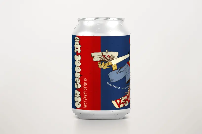
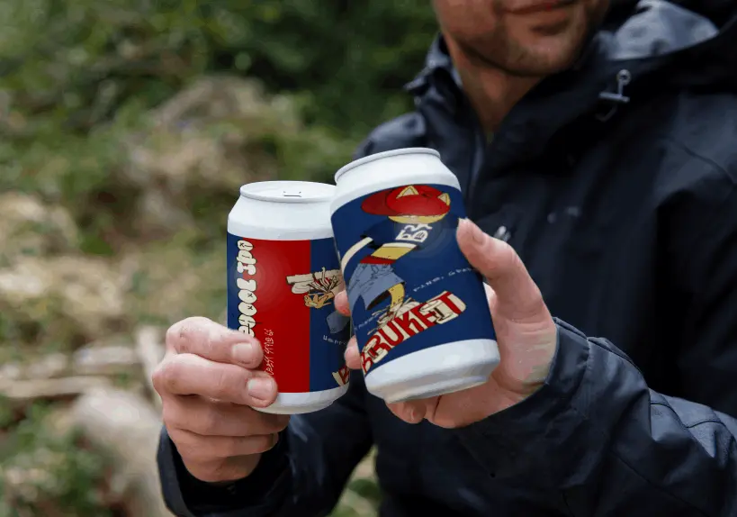
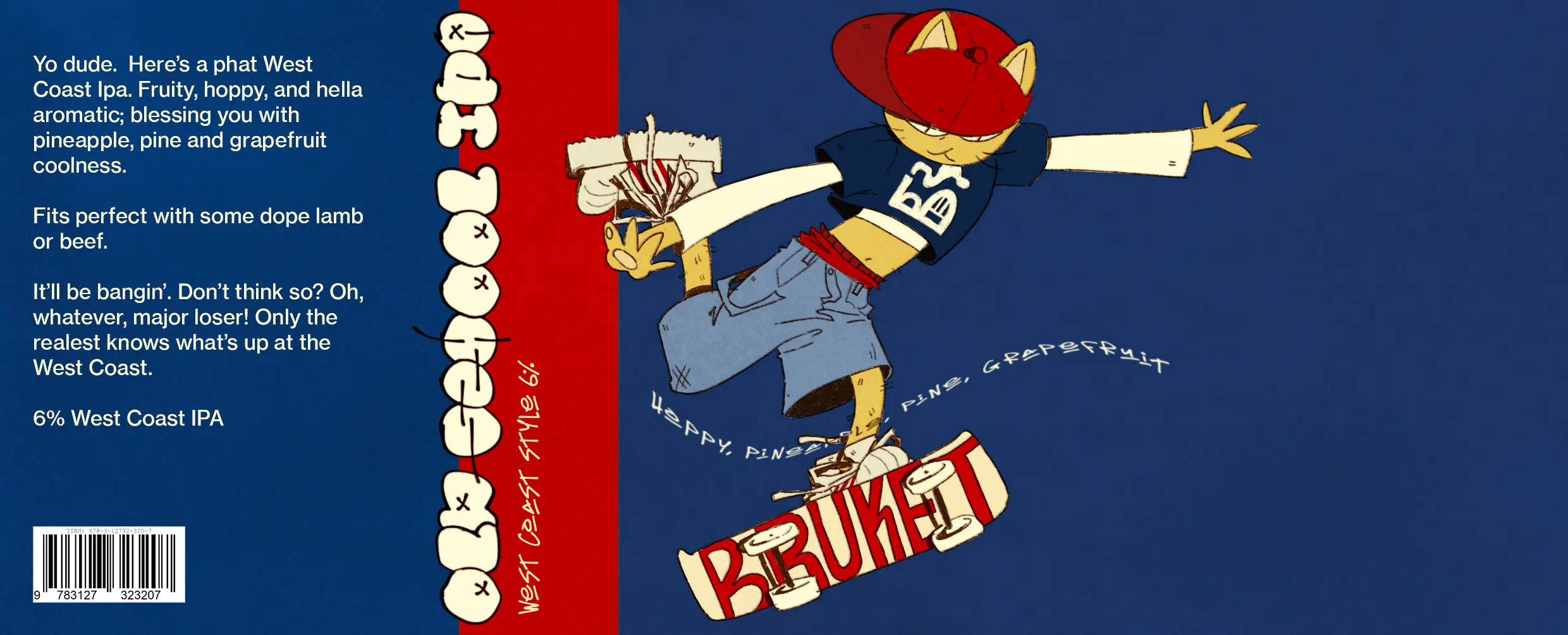
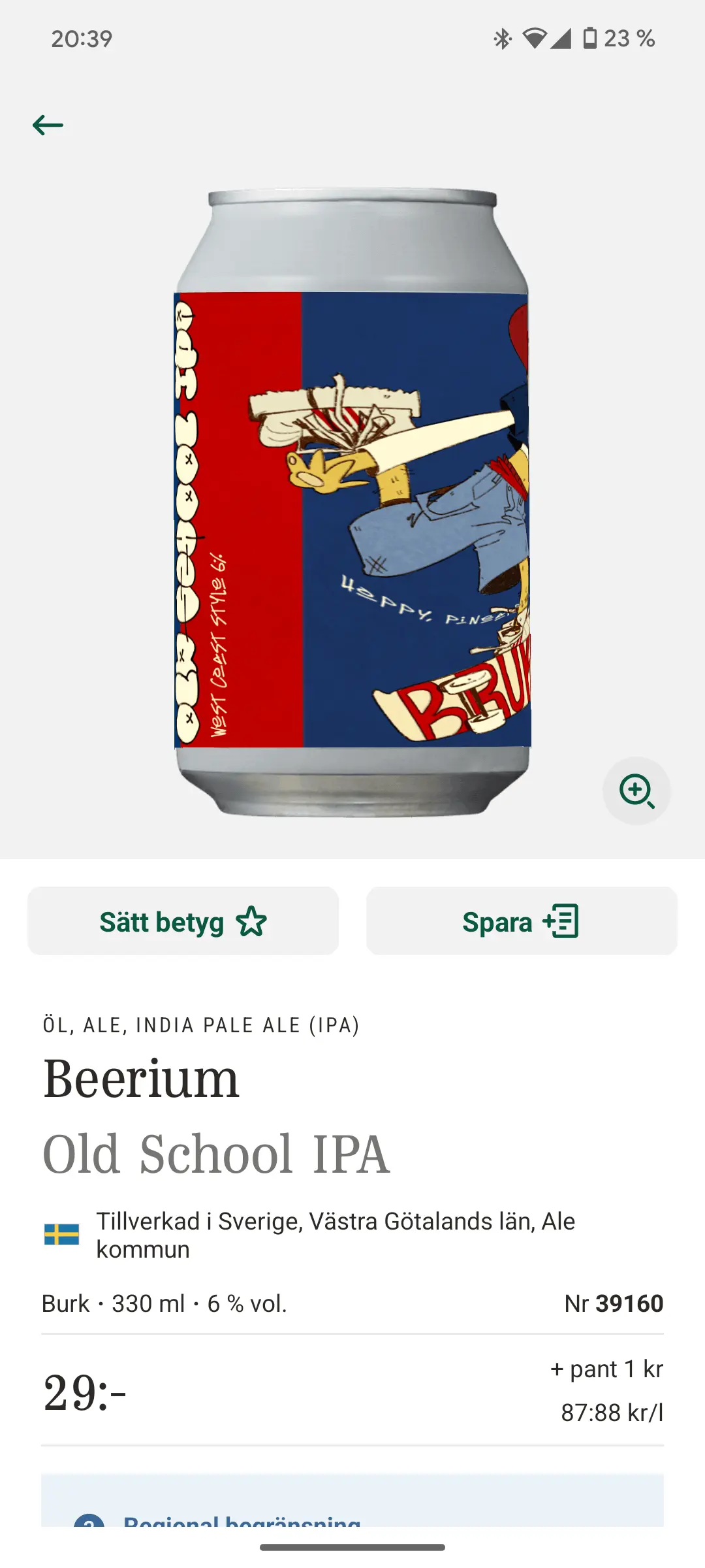
Giving the cans more colour and a mascot character to the cans’ covers distinguishes the cans on the shelf. They catch the customer’s eye.
The cans have fun names. Old School IPA. Pirate Rock IPA. I'll Sleep When I'm Dead. It's a shame the covers don't reflect this. I wanted to highlight the name with a character. Having the cat become a mascot and change with the titles' stories invites to collecting the cans.
Why a cat? I wanted to hint at, once again, old tradition. Back in the day cats were used in breweries to catch rats eating the barley for brewing beer.
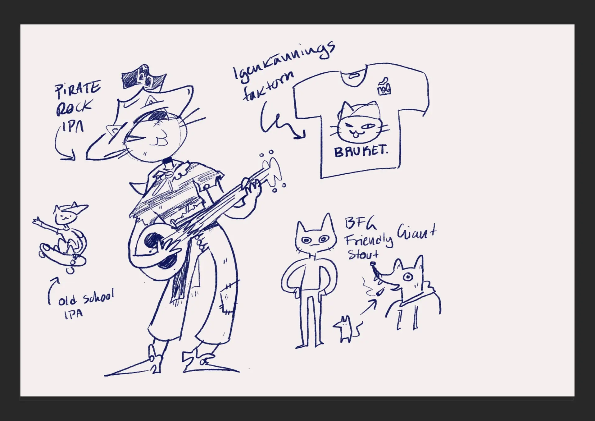
Sketches of the mascot.
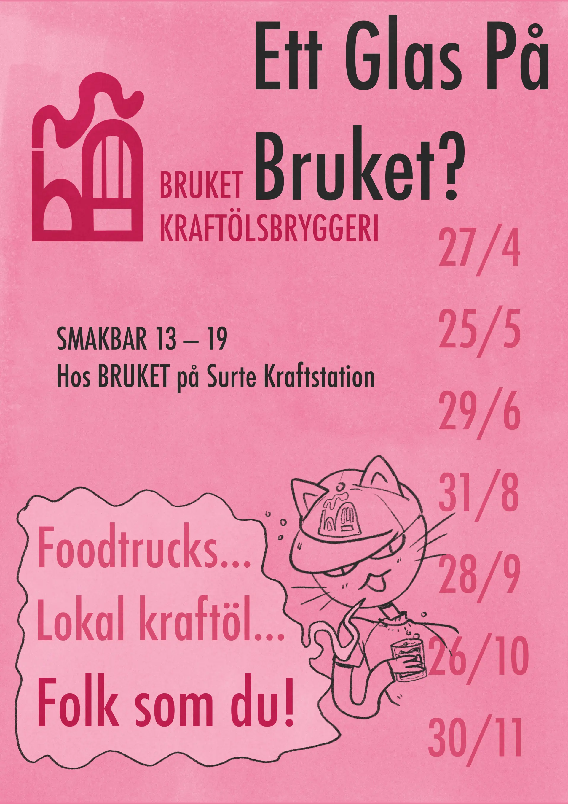
Today Beerium has a taste bar where you can try their beer. Here is a poster promoting it! Pink with an analogue feel to stick out in the city against concrete and metrall.
"A glass at Bruket?"
"Foodtrucks... Local craft beer... People like you!"

Website Building Software